SPEC SHEETS
LAYOUT BY DESIGNERDAD
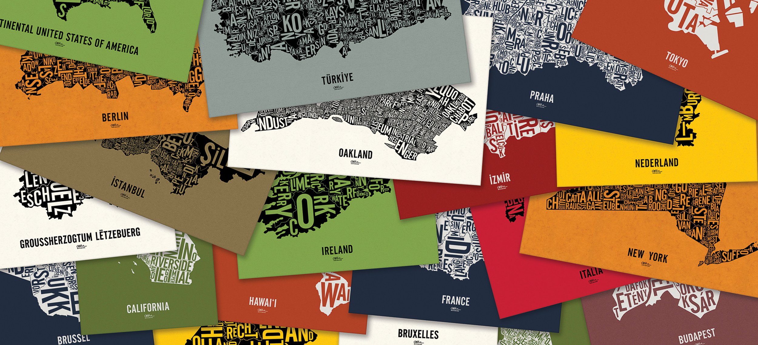
If the creation of a typographic map were a satisfying meal; research would be food-prep, tracing the boundaries would be the appetizer, and type layout the main course.
To a degree, I think anyone with the right resources and technical skills can manage all the steps so far. It's the placement of letters into their boundaries that makes these typographic maps so uniquely designerDad.
I have one self-imposed maxim: FILL UP AS MUCH SPACE AS POSSIBLE.
-
Respect the font: Do not change the aspect ratio of the type
No upside-downs: Rotate letters only 0°, 90° or 270°
Readability: Follow convention, make it intuitive
Kerning: Space letters according to their relative size
Alignment: Align type within the lockups
Proportions: Balanced range of letter sizes
Safety margins: Don't place letters too close to the linesThe rules are listed in order of priority, but really all are equally important. Some are ingrained and inflexible, others intuitive and habitual.
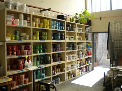
PAPER BY FRENCH PAPER CO.
Established in 1871, French Paper is a sixth-generation family-owned company, and one of the last small


independent mills in America. They’re located in Niles, Michigan.
The company has long been a pioneer in recycled paper manufacturing and is powered by fully renewable hydroelectric generators installed in 1922, having saved over one million barrels of fossil fuel to date. I hope that matters to you, too.
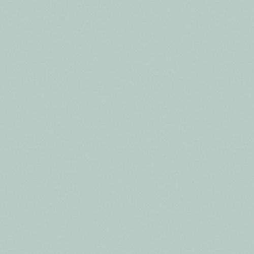
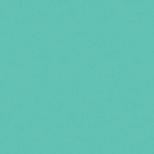
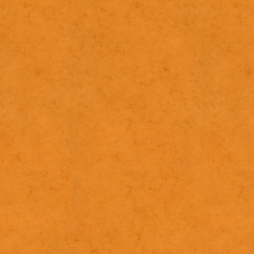
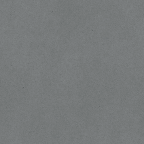
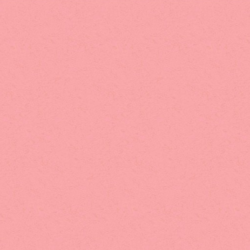
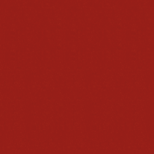
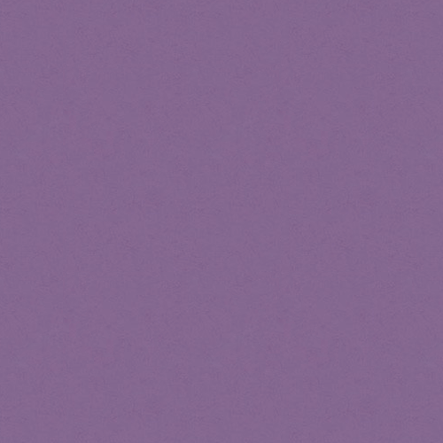
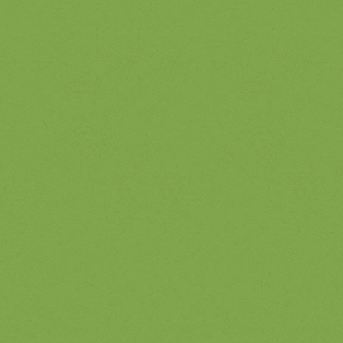
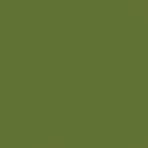
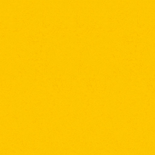
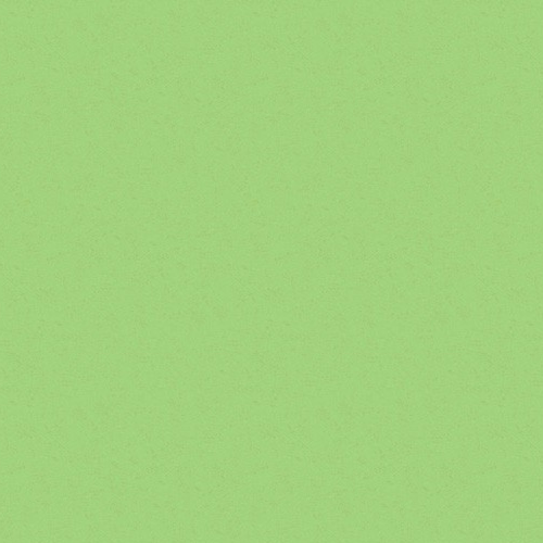
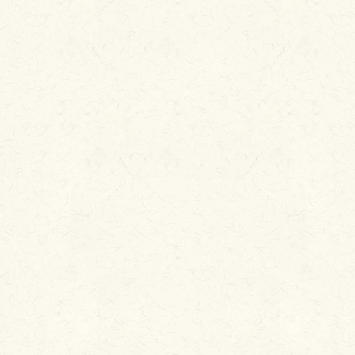
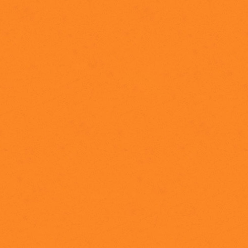
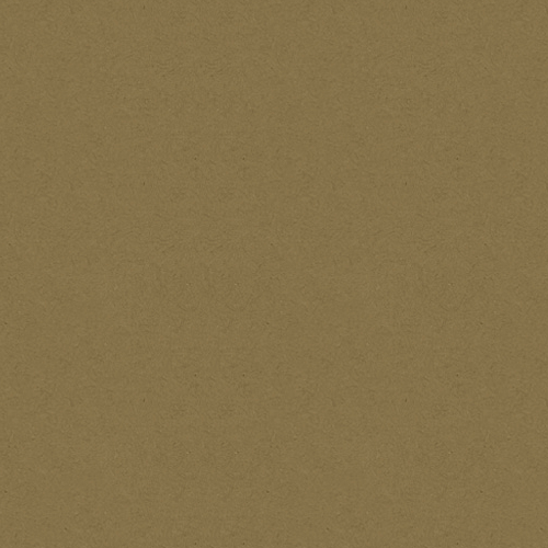
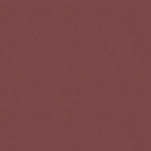
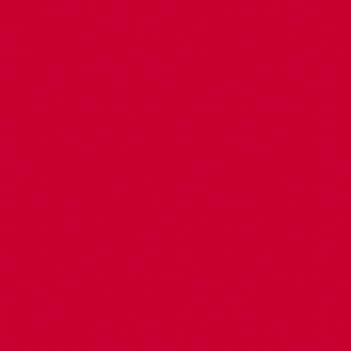
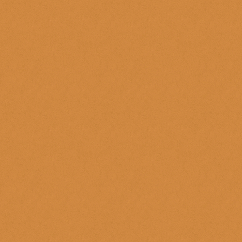
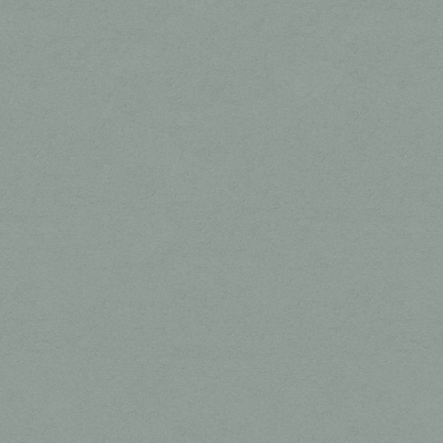
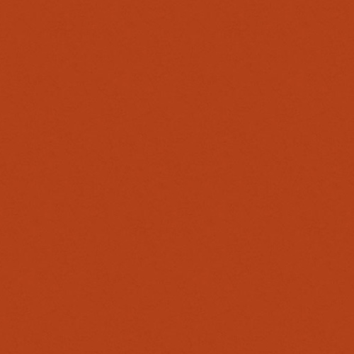
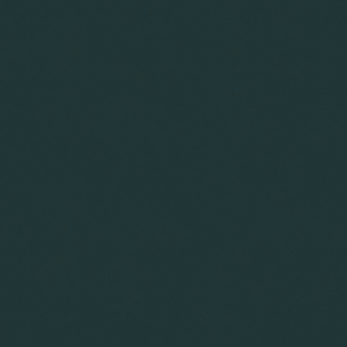
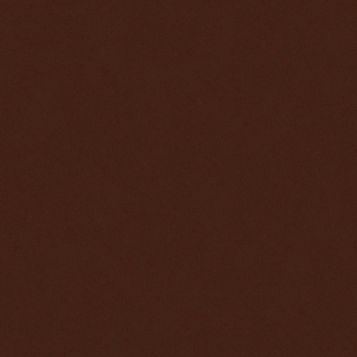
One of my singular delights is choosing paper for the screen printing and French is nice enough to sell their vibrant, textured paper in small quantities. Listed in the image gallery are paper colors used in the screen printing. My standard colors are Newsprint Extra White, Steel Blue and Gumdrop Green.
Please use the search filter in my shop to see color availability.
PRINTING BY MONOLITH PRESS
I found Monolith Press when I took a wrong turn driving around in Emeryville in California. Coincidentally, and so
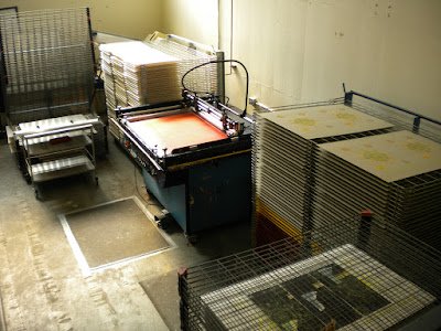
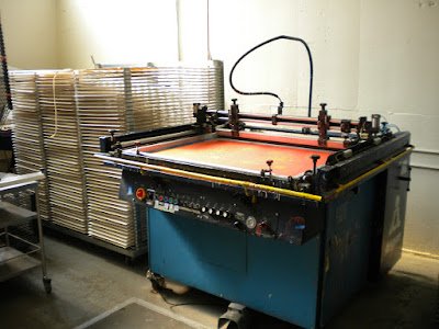
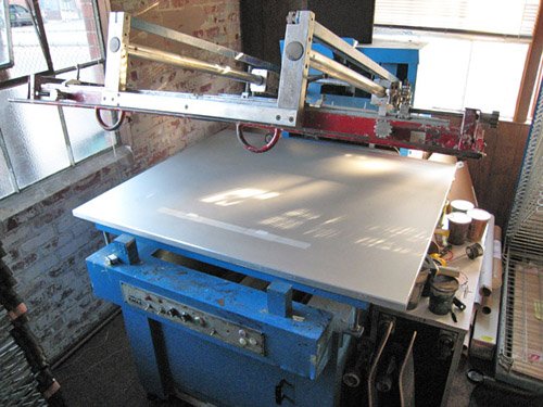
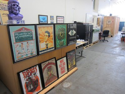
very fortunately, it was around the same time I was searching for a local screen printer. I tell you, It was such a fateful find.
They've since moved to the decommissioned naval base in Alameda, CA., and are located in a building which, until the 1940s, was used to test and repair jet engines.
Their experience, wisdom, and printing capabilities far exceeded by expectations (and my simple printing needs). I haven't looked back.
PAPER BY FRENCH PAPER CO.
Established in 1871, French Paper is a sixth-generation family-owned company, and one of the last small independent mills in America. They’re located in Niles, Michigan (not France).
The company has long been a pioneer in recycled paper manufacturing and is powered by fully renewable hydroelectric generators installed in 1922, having saved over one million barrels of fossil fuel to date. I hope that matters to you, too.
One of my singular delights is choosing paper for the screen printing and French is nice enough to sell their vibrant, textured paper in small quantities. Listed in the image gallery are paper colors used in the screen printing. My standard colors are Newsprint Extra White, Steel Blue and Gumdrop Green. Please use the search filter in my shop to see color availability for the maps.
PRINTING BY MONOLITH PRESS
I stumbled upon Monolith Press when I happened to take a wrong turn driving around in Emeryville, CA. Coincidentally, and so very fortunately, it was around the same time I was searching for a local screen printer. I tell you, It was such a fateful find!
They've since moved to the decommissioned naval base in Alameda, CA., and are located in a building which, until the 1940s, was used to test and repair jet engines.
Their experience, wisdom, and printing capabilities far exceeded by expectations (and my simple printing needs). I haven't looked back.
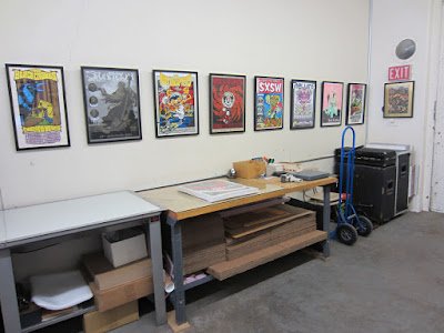
All research, cartography and typographic maps by me. ©2012–2023 Ozan Berke
designerDad exclusively uses paper from the French Paper Co. and the screenprinting services of Monolith Press. I am not affiliated with Ork Posters. As a rule, I do not design maps of locations that Ork has created. designerDad was first to publish typographic maps for USA, Berlin and Oakland.