FREQUENTLY GIVEN ANSWERS
-
My studio is located in Concord, CA. It is in the extension of my house where cars are usually parked. Some might call that a garage, but I call it my studio.
-
Wikipedia says, screen printing is a stencil method of print making in which a design is imposed on a screen of polyester or other fine mesh. Blank areas of the design are coated with an impermeable substance, and ink is forced into the mesh openings by a fill blade (or squeegee) onto the printing surface. It is also known as silkscreen, serigraphy, and serigraph printing. I decided to go with silkscreen.
-
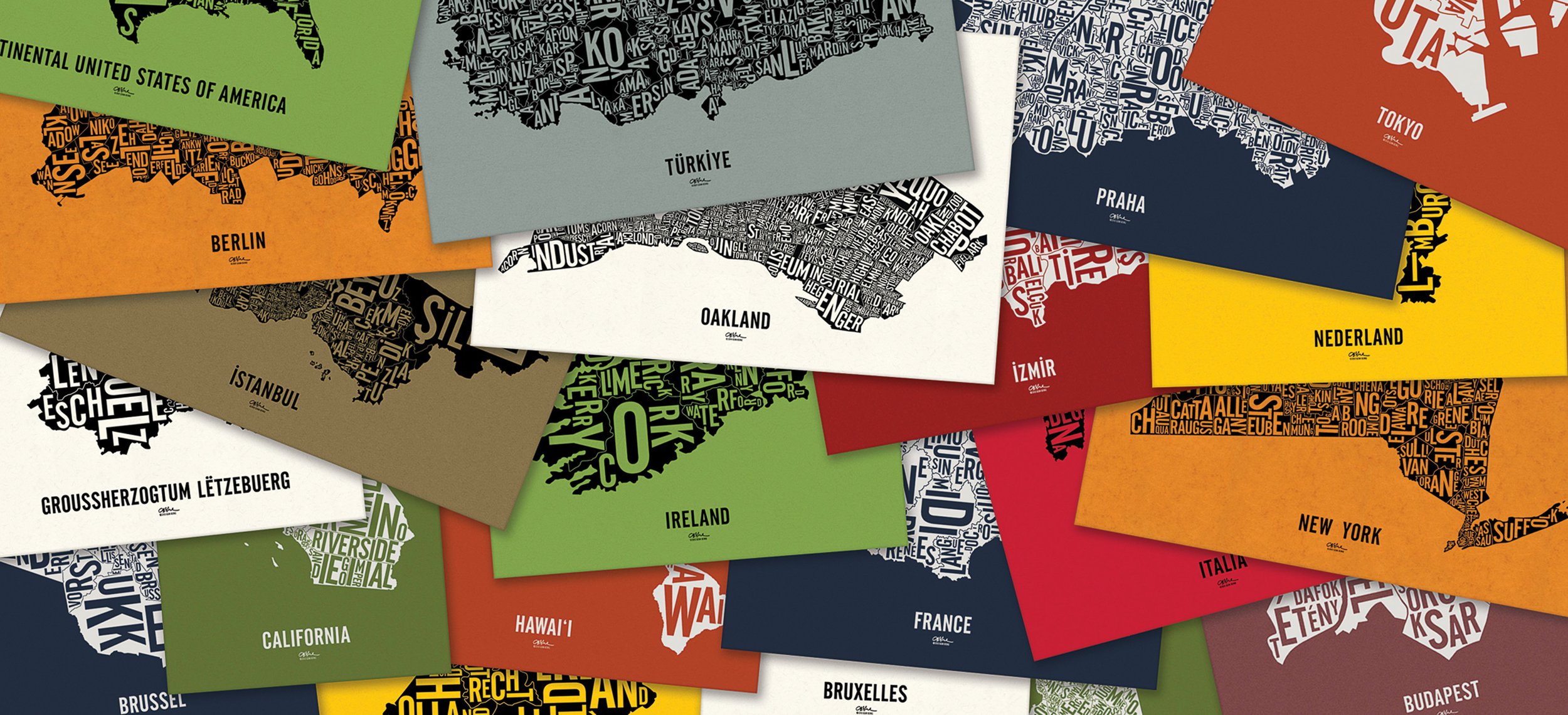
So far I have chosen places that have some sort of meaning to me. But the world is a big place and I'm happy to say that every map will have meaning for someone.
-
Posters are carefully rolled along the grain of the paper and placed in poly tubing to protect them from the elements. They are shipped in sturdy snap-seal mailing tubes which are uncoated, reusable and curiously, don’t need plastic end caps.
-
I use a variety of resources to research my maps, the internet being my primary tool. I take pains to fact-check and cross reference every aspect of the map; including its shape, divisions and borders, and names of places. Since all maps are in their native languages, I always try to have my maps double checked by native speakers, often by people who live there. I won't start designing a map until I'm sure of all my facts.
-
Simple answer: it's better for the environment. The screens used to print the maps are reusable and employing a water-based ink means the screens can be cleaned with water instead of a solvent.
-
Posters are printed using matt ink. Shiny ink has its places, and it's not here.
-
The short answer is no, but the longer answer might be of interest. I certainly try to print the maps as large as possible on the sheets of paper that I use, usually 19"x25". More importantly though, I strive for spatial harmony between the map and the open space around it, and sometimes this means trimming away a bit of paper. You'll find that none of the maps are centered on the paper, yet they are all balanced.
-
Four factors determine what makes my posters limited edition: size of paper, color of paper, color(s) of ink, and finally the content of the poster itself. For example, I printed 10 California posters using black ink on Gumdrop Green paper trimmed to 15x25". I'll never print an 11th California using those same specifications. But as soon as I change paper color, choose a different paper size, select a different ink color, or revise the map due to name change or a mistake (ouch), the result will be a new edition. Each poster is numbered (and signed) on the back in pencil.
-
Yes it is. Currently all my map posters have my signature screen printed on the front, beneath the map title.
-
Please ensure that you fully uncrimp the end to avoid damaging the poster as you pull it out of the tube.
-
International orders are shipped with the contents and value of the package indicated on the required customs declaration form. Shipments may be subject to customs tariffs.
-
Prints will certainly fade when exposed to ultraviolet light, especially those printed on vibrant paper. Keep all your maps away from direct sunlight.
All research, cartography and typographic maps by me. ©2012–2023 Ozan Berke
designerDad exclusively uses paper from the French Paper Co. and the screenprinting services of Monolith Press. I am not affiliated with Ork Posters. As a rule, I do not design maps of locations that Ork has created. designerDad was first to publish typographic maps for USA, Berlin and Oakland.